
AI Reports lets you build a live, interactive dashboard by describing what you want in plain English. Instead of specifying tables, joins and columns, you write a sentence or two — "Create a customers dashboard to show the customer name, contact detail and when it was added to the system" — and the system generates the metric cards, charts and tables for you, connected directly to your live Latner data.
Reports are permanent once created. They refresh against live data every time you open them, can be shared with groups, and can be refined over time without starting again.
1. Finding AI Reports
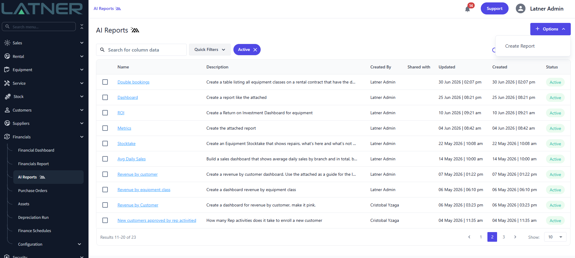
Go to Financials → AI Reports in the left navigation.
By default the list is filtered to Active reports. Use the Active chip to clear that filter, the search box to search column data, Customize to change which columns appear, and Filter by for more specific conditions.
2. Creating a report
-
Click Options (top right) and choose Create Report.
-
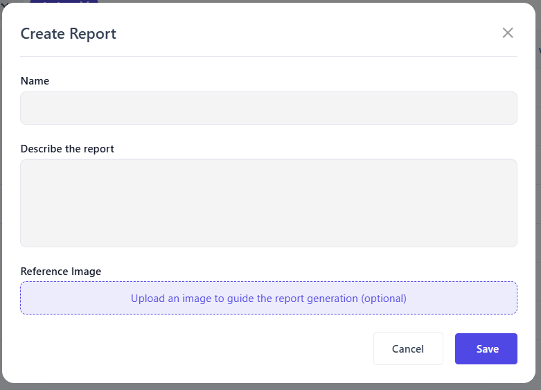
Enter a Name — this is what appears in the list and in the breadcrumb.
-
Fill in Describe the report. This is the important part; see section 3.
-
Optionally add a Reference Image.
-
Click Save.
-
The first report will take usually about 1 minute to generate
The Reference Image field is optional but powerful. Upload a screenshot of a report you already use — a spreadsheet, a report from your previous system, a dashboard you like — and the generator will use its layout, groupings and column order as a guide.
This is the fastest way to recreate something familiar. If you're migrating a weekly branch report that everyone already knows how to read, a screenshot of it will get you closer than a paragraph of description.
3. Writing a good description
The description is your instruction to the AI. Vague in, vague out.
Include:
-
The subject — customers, contracts, equipment, work orders, invoices
-
The fields you need — "customer name, contact detail, date added"
-
How you want it grouped or broken down — by branch, by rep, by category, over time
-
The time period — this month, last 12 months, current financial year
-
The shape — "a dashboard with summary cards and a bar chart"
Examples that work well:
Create a customers dashboard to show the customer name, contact detail and when it was added to the system
Show me a report of each mechanic and how much time they spent on work orders this month, with total hours and average hours per work order
Show revenue by customer for the current financial year, ranked highest to lowest, with a chart of the top 10
Show me a single table with all rental contract e-signature links and their status
That last one is a quick way to see where your rental contract e-signatures are up to. Each link has one of four statuses: Unopened (sent, but the customer has not opened it yet), Opened (viewed but not signed), Signed or Cancelled. Unopened and Opened links are still waiting on the customer, so add "only show links that are Unopened or Opened" to turn the table into a chase list.
You can also ask direct questions. For example, show me a list of all equipment that does not have an assigned QR Code as a table.
4. Asking for custom formulas and scores
AI Reports isn't limited to counting and summing what's already in your data. You can ask it to calculate something new — a ratio, an index, a weighted score, a banding — and it will build the formula, apply it across your records and present the result as a column, card or chart.
This is where the module earns its keep. Most of the decisions a rental business makes come from numbers nobody stores: which units to sell, which customers are drifting, which contracts are quietly unprofitable.
An example
Equipment to Consider Selling — Serialized equipment ranked by weighted disposal score (utilisation, age, maintenance burden, non-op days, time since last off-rent). Bands: 0–24 Healthy · 25–49 Watch · 50–74 Review · 75–99 Possible Disposal · 100+ High Possible Disposal
None of those disposal scores exist in the database. The report combines five separate signals into a single number, ranks the fleet by it, buckets each unit into a named band, and colour-codes the result — so a branch manager sees an actionable shortlist rather than five columns to interpret.
5. Using a generated report
Open a report from the list to see it live.
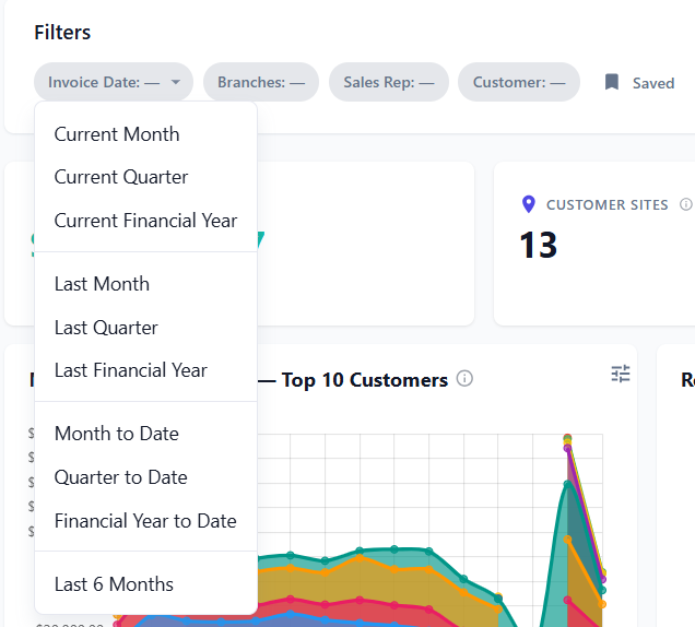
Filters
Every report has a Filters bar across the top, with filters chosen to suit the report's content — for example Date Added, Status, Branch, Entity Type and Type on a customers report. Filters apply to the whole report: cards, charts and tables all update together, so the numbers always describe the same population.
Most filters are optional. Leave one blank and it is skipped, so the report covers everything. The exception is a date that the report uses as the reference point for its calculations, such as an "as at" date on an unpaid or overdue invoices report. If that date is blank, the report comes back empty - see The report shows no data at all in section 11.
To keep a set of filters, click Saved, enter a name under Save New Filter and save it. Saved filters belong to the report, so anyone who opens it can load them from the same menu, and the button shows the name of the one you have loaded. A saved filter is not applied automatically when the report opens - to have a report open with a filter already set, give the filter a default (see section 11).
Metric cards, charts and tables
-
Metric cards give the headline numbers (Total Customers, Active, Pending Approval, New This Month).
-
Charts show trends and distributions — bar charts over time, donut charts for breakdowns.
-
Tables give the underlying detail rows.
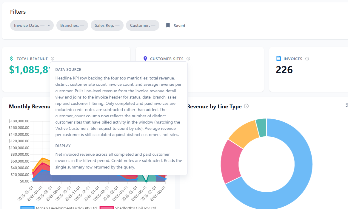
The info icon — check the numbers before you trust them
Every card and chart has an information icon. Click it to see two things:
-
Data Source — where the figures come from and which filters affect them
-
Display — exactly what this element is showing
This is the single most useful habit to build. Before you circulate a number, click the icon and confirm the definition matches what you meant. A card labelled "Active" might be counting something subtly different from your internal definition, and the tooltip will tell you.
Refresh
The refresh icon re-runs the report against current data without regenerating it. Use this rather than Regenerate when you just want up-to-date figures.
6. Refining a report
Two tools here, both about what the report shows. For changes to how it's arranged, see section 8.
Add Feedback — fix specific sections
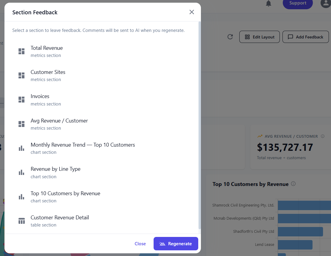
Click Add Feedback to open Section Feedback. Every element in the report is listed with its type (metrics section, chart section, table section). Select a section, leave a comment about what's wrong or what you want instead, then click Regenerate. Your comments are sent to the AI as part of the regeneration. This can be useful when you want a single section to be updated, rather than the whole dashboard.
Use this for targeted corrections:
-
"This should exclude prospects, only count converted customers"
-
"Change this to a line chart and show the last 24 months"
-
"Add the sales rep and last hire date columns to this table"
Regenerate — rebuild from scratch
Regenerate rebuilds the report from its description plus any feedback you've entered. Note that regenerating can change layout and section choices, so if you've spent time arranging the layout, regenerate first and arrange second.
7. Version history — going back if something breaks
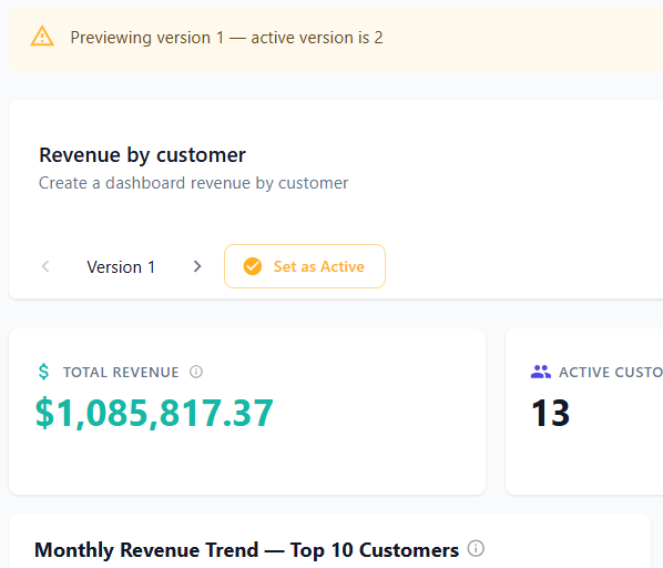
Every time you regenerate, the report is saved as a new version. The version control sits directly under the report title: arrows either side of the version label, and a badge showing which version is currently Active.
-
Use the arrows to step back and forward through previous versions
-
The Active badge marks the version that is live — the one you and anyone you've shared with will see
-
Step back to an earlier version and make it Active to revert
This is your safety net. Regeneration is not always an improvement: a feedback comment can be interpreted more broadly than you intended, or a rebuild can drop a section you wanted. Rather than trying to talk the AI back to where you were, step back to the version that was right.
Practical implications:
-
Regenerate freely. There's no penalty for experimenting, because nothing is overwritten.
-
Note the version number before a big change, so you know what to return to.
-
On a shared report, check the new version before leaving it Active — everyone with access sees the Active version.
-
Compare rather than guess. If you're unsure whether a change helped, step between the two versions and look at the same numbers in each.
8. Changing the layout
You can move, resize and delete sections in two ways — by hand, or by describing what you want. Both do the same job, so use whichever suits you.
Option A: Edit Layout — do it by hand
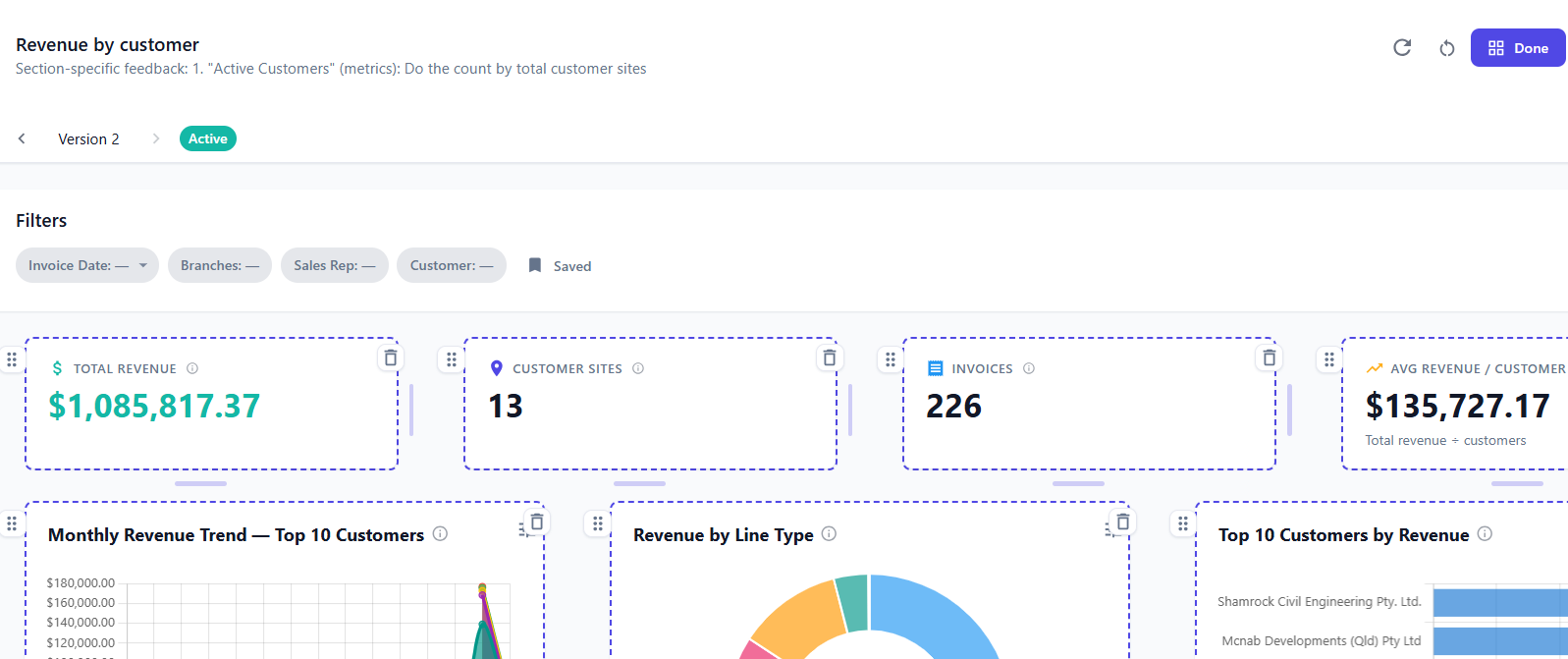
Click Edit Layout to enter layout mode. Every section gets a dashed border and:
-
Drag handle (top left) — drag a section to a new position
-
Resize handle (right edge and bottom) — make a section wider, narrower, taller or shorter
-
Delete icon (top right) — remove the section from the report
-
Reset icon (in the header) — undo your layout changes
Click Done to save.
Option B: Edit Report — describe the change
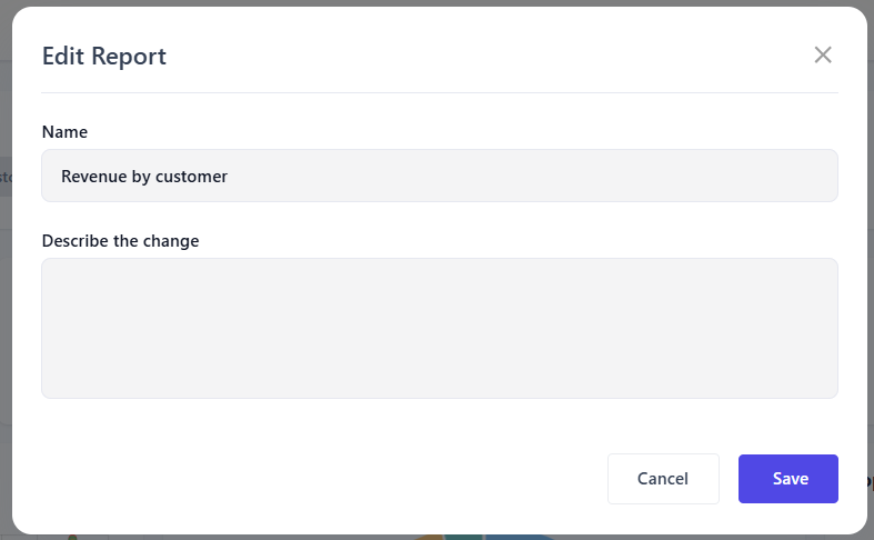
Open Edit Report from within the report and use the Describe the change field to say what you want in plain English. This is the same set of operations — moving, resizing and deleting sections — without the dragging.
-
"Remove the Pending Approval card"
-
"Move the Customer Directory table above the charts"
-
"Make the Customers Added Over Time chart full width"
-
"Put the four metric cards in two rows of two"
9. Managing reports
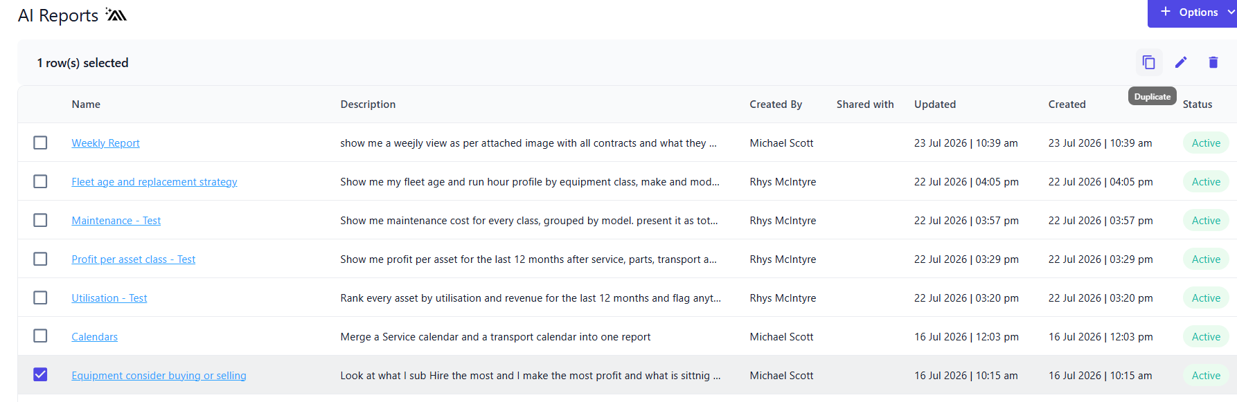
Tick the checkbox next to a report in the list to reveal the action icons in the top right:
-
Duplicate — copy the report. The fastest way to build a variant: duplicate a working report, then edit the copy's description to change the branch, period or grouping.
-
Edit — opens Edit Report for the report's details:
-
Name
-
Description — the underlying instruction
-
Status — set to Inactive to retire a report without deleting it. Inactive reports disappear from the default Active view but keep their history.
-
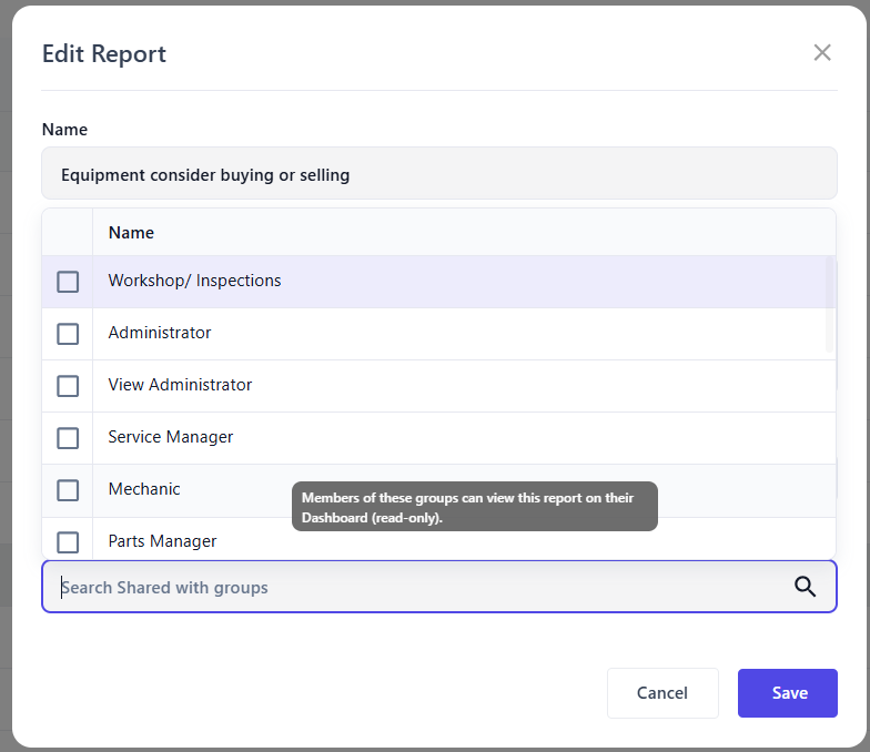
Shared with groups — search and select the groups whose users should see this report without the AI Report permission (see Sharing below)
-
-
Delete — permanently remove the report
Sharing
Who sees a report depends on the AI Report permission (under Financial in a permission group):
-
With the AI Report permission, a user can build, edit, duplicate and delete reports, and sees every report, whether or not it has been shared. The permission is also what puts AI Reports in the Financials menu.
-
Without it, a user sees only the reports shared with a group they belong to. Add those groups in the Shared with groups field and the report appears on their Home dashboard. They can view and filter it, but not edit it.
Share the finished, verified version — not a draft you're still refining, since regenerating changes what everyone sees.
Viewing Reports as a User
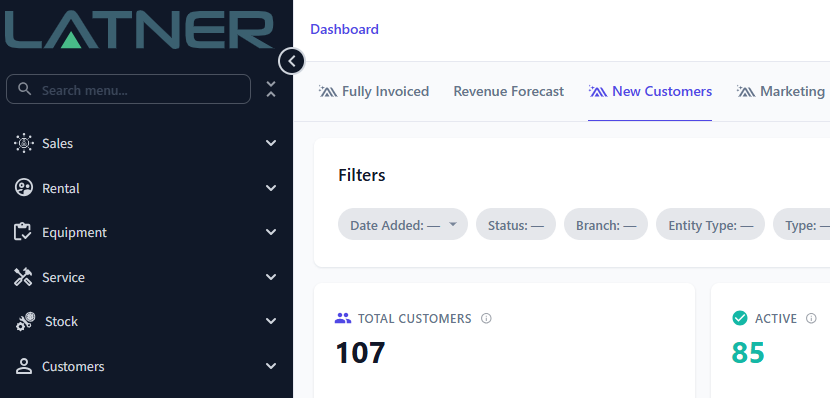
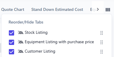
Every active report a user can see appears on their Home screen in the dashboard section - for a user without the AI Report permission, that means the reports shared with their groups. Reports set to Inactive are left off. AI Reports will have the Latner AI icon next to the name. Each user can hide or reorder the reports in the dashboard section.
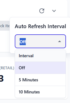
If a user has the dashboard on a monitor or TV, they can set an auto refresh for every 5 minutes or 10 minutes. This can be useful when display a dashboard on a TV in a workshop or office.
10. Recommended workflow
-
Start rough. Write a short description and generate. Don't try to specify everything up front.
-
Check the definitions. Click the info icons on every card and chart. Confirm the data source matches your intent.
-
Correct with feedback. Use Section Feedback for anything wrong, then Regenerate. Experiment freely — every regeneration is a new version, and you can step back to any of them.
-
Arrange the layout. Once the content is right, tidy it up — drag it into shape with Edit Layout, or describe the changes you want in Edit Report.
-
Add notes to any section whose method, caveats or data coverage a reader would need explained.
-
Set your filters so the report opens the way you want.
-
Confirm the Active version is the one you want people to see.
-
Share it with the relevant groups.
-
Duplicate rather than rebuild when you need a close variant.
11. Troubleshooting
The report shows no data at all. Check the Filters bar first. A blank filter is normally skipped, but on a date-driven report - unpaid and overdue invoices are the classic example - the date or date range is what the figures are measured against. Leave it blank and every card, chart and table comes back empty.
-
Pick a value in the Filters bar. The report fills in straight away. To keep the selection, save it from the Saved button so it can be loaded next time.
-
Make the report open with a date already set. Click Add Feedback, select the section, comment something like "Default the invoice date filter to the Current Financial Year", then click Regenerate. You can put the same request in Edit Report › Describe the change instead. A date range filter can default to Current Month, Current Quarter, Current Financial Year, Last Month, Last Quarter, Last Financial Year, Month to Date, Quarter to Date, Financial Year to Date or Last 6 Months - a longer period such as "the last 12 months" is not available as a default. A single date filter (rather than a range) cannot have a default at all, so ask for it to become a date range, or ask for the report to use today's date when it is blank.
-
A date is set and it is still empty. Click the section's info icon and read its Data Source, which says where the figures come from and which filters affect them. Another filter, such as a branch or status, may be excluding everything.
Inactive or deactivated equipment still shows in my report. How do I remove it? This is expected. Latner never deletes equipment - when a machine is deactivated, sold or disposed of, its record and history stay in the system so your reporting stays complete. A report that does not say otherwise, such as an equipment purchase report, therefore still includes machines you have deactivated. To hide them:
-
Open the report and click Add Feedback.
-
Select the affected section and comment "Hide all Inactive Equipment". Do the same for any other section that should leave them out.
-
Click Regenerate.
Deactivated equipment has the rental status Inactive. If sold or disposed machines should go too, say so in the same comment ("Hide all Inactive, Sold and Disposed Equipment"). If something looks wrong after regenerating, step back to the previous version (section 7).
The numbers look wrong. Click the info icon first — nine times out of ten the calculation is correct but the definition differs from yours (for example, including prospects, or using calendar month rather than financial period). If the definition is genuinely wrong, leave section feedback stating the correct definition and regenerate.
I regenerated and the new version is worse. Step back to the previous version and make it Active. Don't try to talk the AI back to where you were — reverting is faster and exact.
A number looks impossibly good or bad. Check data coverage before you celebrate or panic. Costs, hours and recharges only appear if they were captured against the right record. Once you've established the coverage, record it in a note on that section so nobody has to work it out again.
The report ignored part of my description. Break the request up. Generate the core report first, then use Add Feedback to request the parts that were missed, one section at a time, and regenerate.
A chart shows gaps or unexpected spikes. Usually a data issue rather than a report issue — check whether records exist for those periods, and whether a filter is excluding them.
Regenerating undid my layout. Expected behaviour. Refine the content first, arrange the layout second — or step back to the version that had the layout you wanted.
People keep asking me what a figure means. Put the answer in a note on that section. It's visible to everyone with access and it stays with the report.
A colleague can't see my report. If they don't have the AI Report permission, they only see reports shared with one of their groups - open Edit and add a group they belong to in Shared with groups. Also check the report's Status is Active, because inactive reports don't appear on the Home dashboard.
I don't want to lose a report but it's cluttering the list. Set its Status to Inactive rather than deleting it.